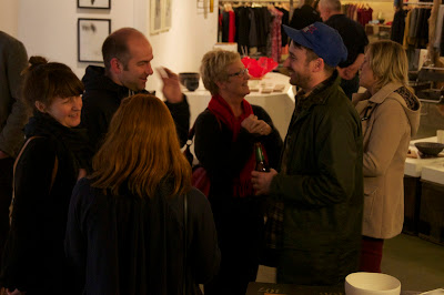
this last photo is a pretty terrible photo - the focus is just awful.
but it's such a lovely image - composition, negative space, atmosphere.
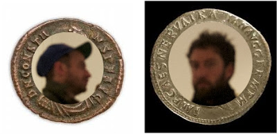
Grant and Michael look like perfect profiles for ancient coins.
(worst graphic design ever. i must reiterate that this is kent's doing!)


No comments:
Post a Comment